

Name: Matthew Hawtin
Occupation: Visual artist, designer, DJ
Nationality: Canadian
Current release: Matthew Hawtin's most recent work is a continuation of his Torqued series, a series of painting and fiberglass panels. He is also expanding into NFTs, as always "blurring the the boundaries between painting, sculpture and design", between the analog and the digital.
Recomendations: CVJ by Julian Schnabel; Blue by Derek Jarman
If you enjoyed this interview with Matthew Hawtin and would like to find out more abouthis work, visit his official website. He is also on Instagram.
In 1998, Matthew Hawtin contributed to the design of Plastikman's iconic Consumed album. Together with Chilly Gonzales and with mediation by Tiga, Plastikman aka Richie Hawtin has created a new version of the album using an update of the original artwork. It is now available via Tiga's Turbo imprint.
[Read our Richie Hawtin / Plastikman interview]
[Read our Chilly Gonzales interview]
[Read our Tiga interview]
Can you talk a bit about your interest in for design and painting? What was it about the relationship between music and design that drew you to it?
My interest in design actually grew out of painting. I had a good knowledge of art and art history yet I didn’t know much about design. (I was too narrow-minded when I was younger). Once I scratched the surface I started to understand the relationship of art and design, as well as architecture, which opened my eyes and further informed my thinking. The book Minimal by John Pawson helped me see the connection of reductive things across disciplines.
The connection with music and design was always there. From an early age, because of my Dad’s love for music (and Hi-Fi), music was always on and around us. Music becomes a big part of our adolescent years by defining who we are and helping us process our emotions. I grew to understand that music could be expressed through the design of a painting, probably because I was interested in an expressing emotion, which music can do so perfectly even though it’s temporary and abstract.
Which music related artworks and designs captured your imagination in the beginning? What makes for a great music related design?
A couple of album covers come to mind.
Electric Café by Kraftwerk (1986) because it gives an early interpretation of what computers and electronics look like inside, or what we look like inside a circuit board. Once you heard the music, the cover made a lot more sense.
I also think about Duran Duran’s ‘The Reflex’ 12” single (1984) because that design uses line, shape, colour and texture to visually express the music in a cohesive and interesting way. There was something avant-garde about that design yet it still makes sense musically. 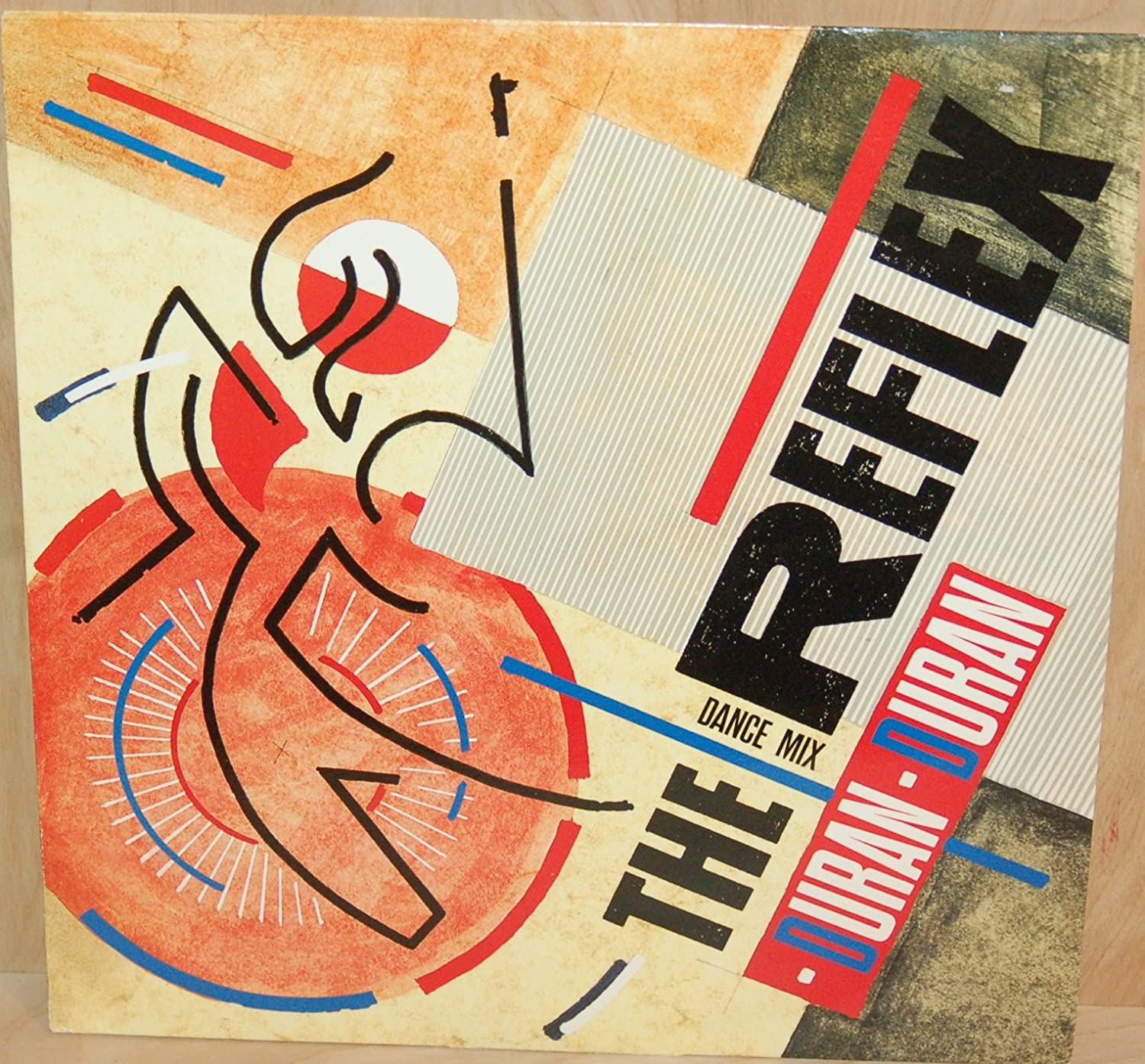
I can’t really say what makes for a great music related design. I think it depends on your personal relationship to the music or the design. Usually you know it when you see it.
What made it appealing to you to contribute to and design album covers? What was it that you wanted to express and what did you feel did you have to add artistically?
It was never my intention to specifically design album covers, it just happened naturally when the first F.U.S.E album, Dimension Intrusion, was released. On the whole my album designs have worked serendipitously with the music that’s been presented to me, especially with the covers for my brother’s music and label. It has usually been the case that his music and something I’ve done, or am doing visually, work to make a great combination. Let’s call it, brotherly alignment ;)
I don’t think I’m seeking to express anything more than what I already express visually but if the music connection takes it to another level then that’s a bonus. This combination can also be a great opportunity to show your work in a different way and to a new and wider audience.
How would you describe your development as an artist in terms of interests and challenges, searching for a personal voice, as well as breakthroughs?
There are a couple of key time periods in my development as an artist.
My post-university time when I was trying to unlearn what I had been taught and work through all my influences was a challenging but necessary time. Then the moment in 1997 when putting A + B together = D was not expected. It was a moment a seeing something not considered and realizing that D was a better path.
That was the beginning of the ‘Torqued Painting’ series. From this point I was able to find my own voice and started building my own aesthetic language, which continues today.
What, would you say, are the key ideas behind your approach to art?
For the most part I see my approach to art as a continuation of the previous piece and another evolution in the thought process. I work with simple elements to express ideas but behind that there’s usually some emotional value I’ve been considering.
My source material remains open to anything – a song, a quote, a book, a film, another artwork – it’s then distilled and manifested through my visual language.
I also think the medium has an influence on the work – paint, collage, prints or a digital artwork. The specifics of the medium can influence the output.
What kind of relationship is there between the cover of a release and the music? What can the visual layer add to the music or how can it even change its impact?
For me, the hope is that there’s some connection between the artwork and the music. That just makes the whole ‘package’ more enjoyable and intrinsically more valuable to the individual. It’s also about what will represent the music for you, the individual, and how you come to visualize songs on an album.
Conversely, I also understand that sometimes there isn’t any connection between music and cover art and that some albums use artwork that has no specific reference to the music. Maybe the artwork is well known by itself and makes for an interesting dialogue between what is heard and what is seen. Does the iconic cover for the first Asia album, Asia, have any reference to the music? Hard to say but it’s interesting to think about.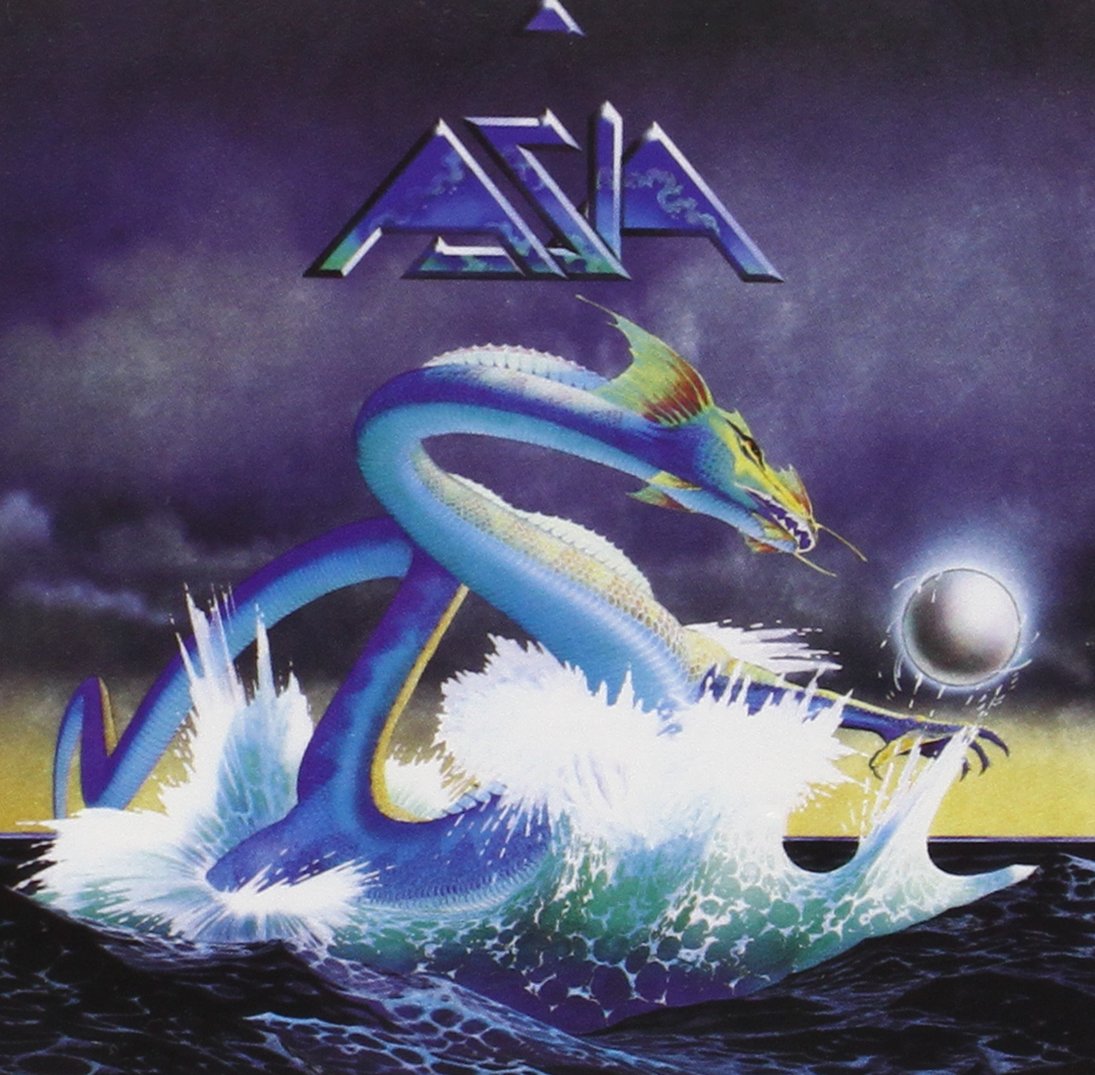
As a side note, I think the youth of today have a different relationship with album artwork than people (like me) who’ve had cassettes, vinyl and CDs as part of their lives. That physicality of owning a release is a lot different to the Spotify generation who don’t own music irl.
Over the course of your development, what have been your most important tools and materials - and what are the most promising strategies for working with them?
In terms of physical tools, I think learning from an early age to buy the best quality paint and good brushes has served me and my artwork well over the years. Working with new materials, even if it’s new paint mediums can always spur on new ideas.
Intellectually, the most important tool is your brain and being open to other creative disciplines, seeing connections and inspirations that move across mediums. Then using this awareness to keep your work evolving from one work or series to the next. It’s not always going to seem like a linear progression but that keeps things interesting, for yourself and the viewer. When you look back and connect the dots it will probably make more sense.
In the booklet to the F.U.S.E. Box, you write: "Although my artwork was not part of Consumed per se, it could be said that the paintings and the music once again share a similar language evoking space and emotion." Can you talk about that a little?
The time around the Consumed album was an important and lovely time. Rich and I were living together and our studios were literally next to each other, all under one roof. We were also travelling together and visiting museums and galleries a lot during this time. We brought our experiences back with us to our studios and made some beautiful work.
I could hear Consumed being made and Rich could see my Torqued Paintings develop. Because of this physical and emotional connection we had this similar language and space in which to manifest our ideas, and which consequentially helped set in motion our respective careers.
For the new version of the album, Consumed in Key, the design was very subtly retouched (if that's the word). What are your thoughts on this process, which can be likened perhaps in acoustic terms to remastering?
The Consumed in Key album cover is a very thoughtful redesign. It references the original, which it should, by keeping the shape but changing the colours and then it uses those changes to reference the piano, which is the ‘new’ part of the music. It’s very well done. 
I also liken it to the release of Concept 1 – 96:VR by Thomas Brinkman, which was a re-interpretation of my brother’s original Concept 1 series. Here, the artwork remains the same but the colour of the dots change to show that it’s different. It’s subtle but effective.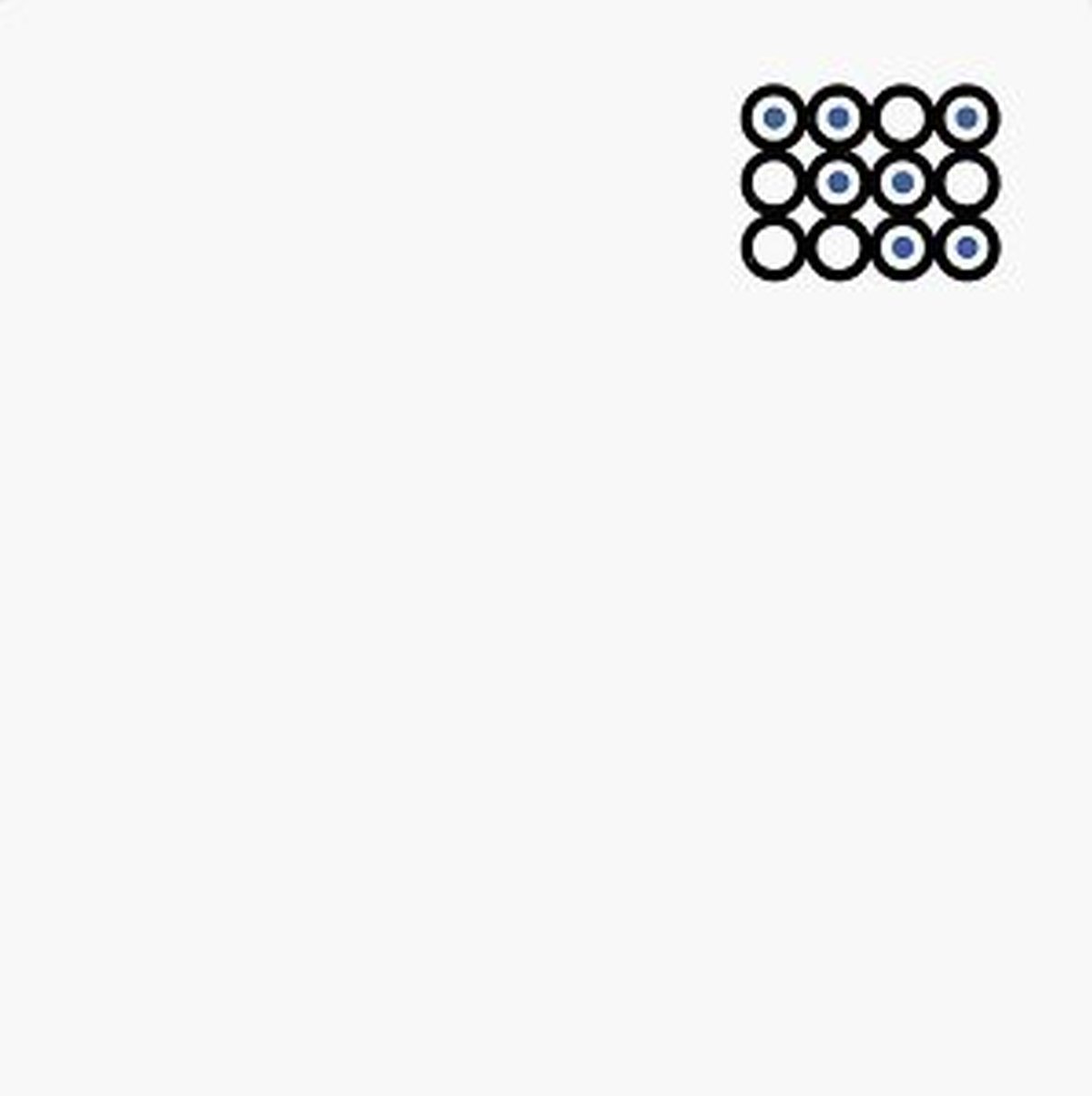
In 2011 and 2012, you designed all covers for the Plus 8 imprint. What were some of the considerations for your work at the time?
To be honest, this is a great example of me working on a series that happened to look good as individual album covers and were different enough that each release looked unique.
Our thinking also considered our new relationship with music. At the time more people were using iTunes and iPods to carry and organize their music so having an interesting visual artwork became an important way to find and ‘visually’ label songs & albums.
I would assume that a major part of creating the design is the ability of interpreting the music and the narrative/emotions/concepts at play. Tell me about how this works for you and how these interpretations in turn lead to images and a finished design.
I don’t think there’s any formula for making things work together.
With the early F.U.S.E. artwork it was a unique moment in time where my artwork made visual sense to my brother’s music. This might have been because we were both experiencing the electronic music culture of the early 1990s so we had similar sensibilities. The connection helped the music and art interpretation.
Incidentally, when we released the F.U.S.E. anniversary box set in 2019 and we needed artwork for Computer Space, the unreleased music, I went back into my files and found an unreleased artwork from the same period that matched perfectly with the music. 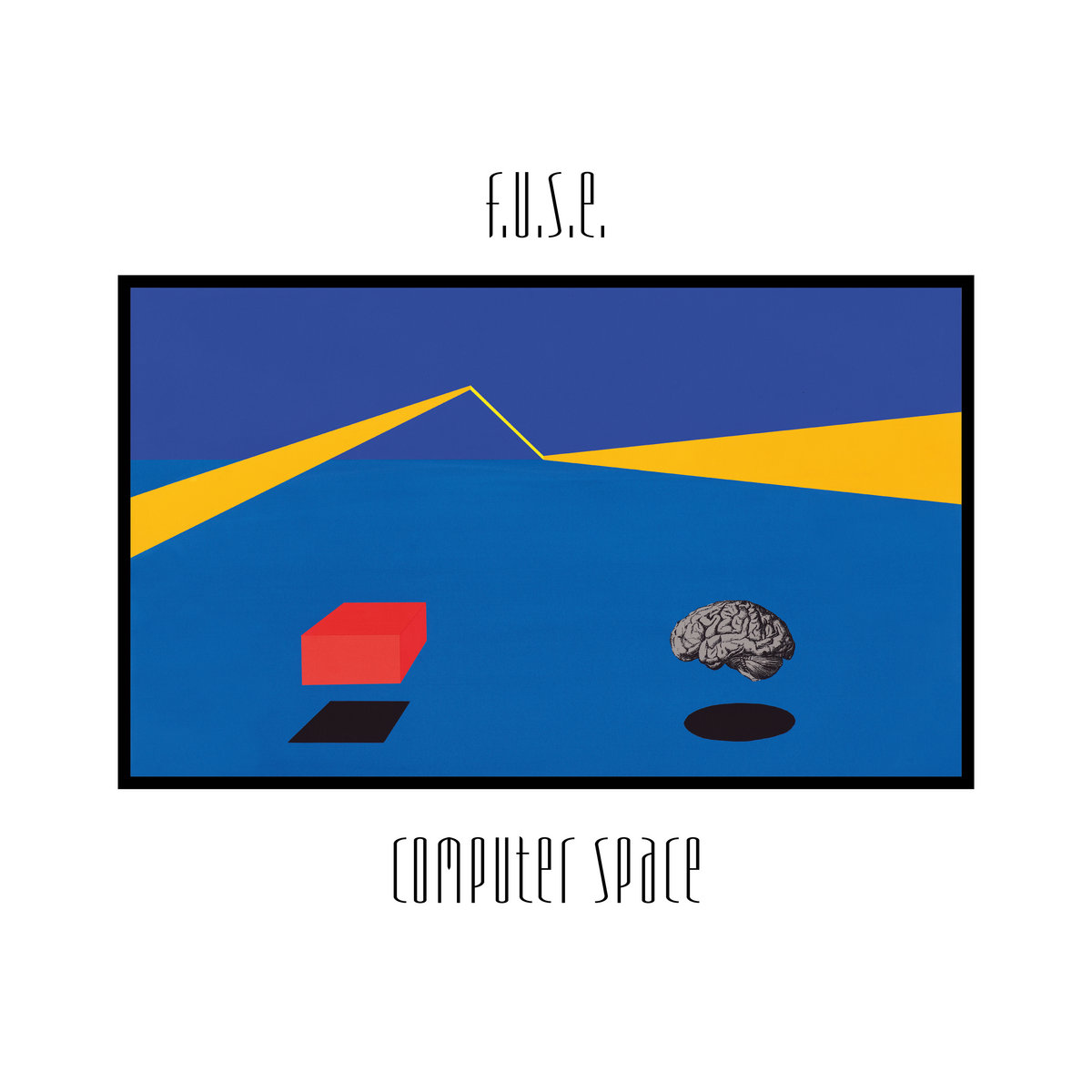
I’ve said before that I’ve never consciously attempted to paint music yet unconsciously maybe I am.
What, from your perspective, are preconditions for a fruitful collaboration between yourself as a mainly visual artist and a musician?
I would say there should be some mutual respect for each other’s work and some history together can help to have a deeper understanding of the artist. Then, at the very least, you might have an idea of what they won’t like.
Once a music related project is finished, what is the value of the design you created outside of its original, music related context?
I think this depends if it’s a specific commissioned design or if its come from an existing artwork. The commissioned design probably wouldn’t become part of my catalogue unless there was some intention of it being a completed artwork. The design would have value in relation to the music release and it would have some value in relation to my creative output. It would depend if it was part of series, a standalone piece or just a commissioned design.
Different designers could potentially approach the same project with strikingly different images. Would you say there can be 'wrong' and 'right' decisions in this regard? In which way can some designs (such as album covers) be considered 'definitive'?
Tough question. I don’t necessarily think there’s a right or wrong in design, especially album covers. It's more about what works and what doesn’t, and what ‘fits’ with the music. This is a matter of opinion, which can be very subjective.
I’m not sure what makes an album design ‘definitive’. I think that’s more about the music on the album being termed definitive and the album cover is a component of that and defines it visually.
Creativity can reach many different corners of our lives. Do you feel as though creating a painting or an album cover is inherently different from something like making a great cup of coffee? What do you express through visuals that you couldn't or wouldn't in more 'mundane' tasks?
I think it all depends on the person. You can put the same amount of passion into making a painting and into making a great cup of coffee but the results are different.
I think there’s something about the idea of craft in this question because craft can elevate the mundane onto a new level of experience. There’s something to be said and appreciated about a barista who really cares for the coffee they make, the same way an artist brings together basic design elements to make something original. There’s a similarity in the intent yet the results of coffee and artwork have different intrinsic values. Coffee, for most people, doesn’t have the status as a work of art though it can give similar enjoyment.
I feel that there are more possibilities to express yourself in an artwork, which allows you to go deeper in what you’re trying to express. Though, not everything has to be about craft. I’m happy to sometimes enjoy the mundane, just to give myself a break from always being creative.
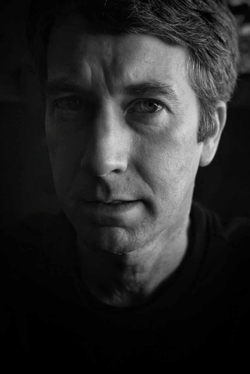 Matthew Hawtin Interview Image by Stephen Nilsson
"I work with simple elements to express ideas. But behind that there’s usually some emotional value I’ve been considering."